Antavo’s reporting Dashboard allows you to create visually represented statistics on the homepage of your Management UI. Built-in editors assist in setting up scorecards and charts, allowing you to define the statistical data you wish to visualize on the Dashboard. The Dashboard appears immediately after logging into the Management UI, and you can return to it at any time by clicking the first icon at the top of the main sidebar.
When editing charts or scorecards, you preview how Dashboard elements will appear, even before saving changes and making them live on the Dashboard.
Use categories to organize your coherent charts and cards. Category tabs are displayed on the left side of the Dashboard, allowing you to navigate and switch views easily.
Configuring charts
Charts are designed to provide insights into the changes in your metrics over time. For example, you can track the number of points earned or redeemed, reward redemptions, loyalty members (categorized by country or gender), challenge completions, customer tiers, and shares.
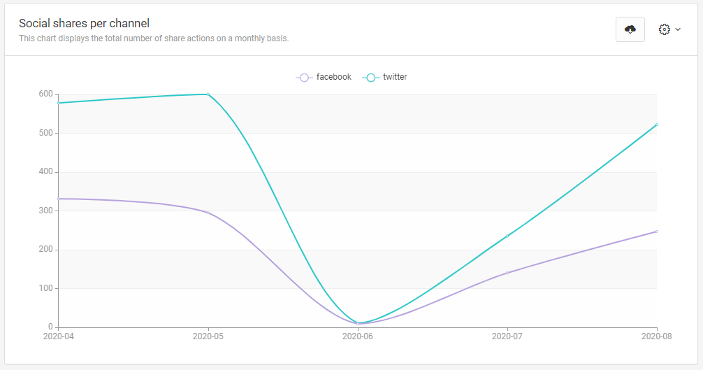
By analyzing charts, you can identify trends or peak periods. If you notice any undesirable customer behavior, you can take immediate action, and adjust your loyalty program accordingly.
Add a new chart
To create a new chart, click the Create chart button on the top right-hand side of the Dashboard.
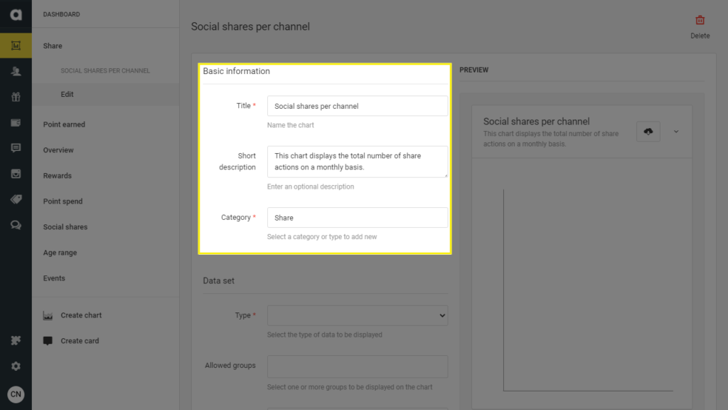
Basic information
Add chart title
The title will appear at the top of the chart on the Dashboard. Please ensure that the title does not exceed 32 characters.Provide a short description
Include a brief description that does not exceed 128 characters.Select or create a category
Choose an existing category from the dropdown or create a new one by typing a category name into the field. Categories are displayed as separate tabs or pages on the Dashboard where cards and charts are organized. Make sure the category name does not exceed 32 characters.
Data set
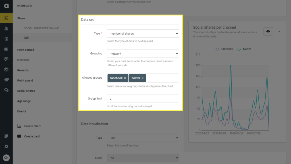
Define the chart data type
Select a data type from the dropdown menu to determine the information displayed on the chart. Each chart can only represent one data type. For multiple data types, please create additional charts.Group your data
Organize your dataset to compare results across different subsets of data. For example, you can compare the number of shares across social media networks.Select data groups for display
Choose one or more groups to visualize on the chart. You can narrow down the data display to specific subsets, such as showing only the number of Facebook shares on the chart.
You can filter by customer events. The data type should be set to action, to include the custom event as an available option in the Allowed groups field.Limit displayed groups
If necessary, limit the number of groups displayed on the chart to focus on the most relevant data.
Data visualization
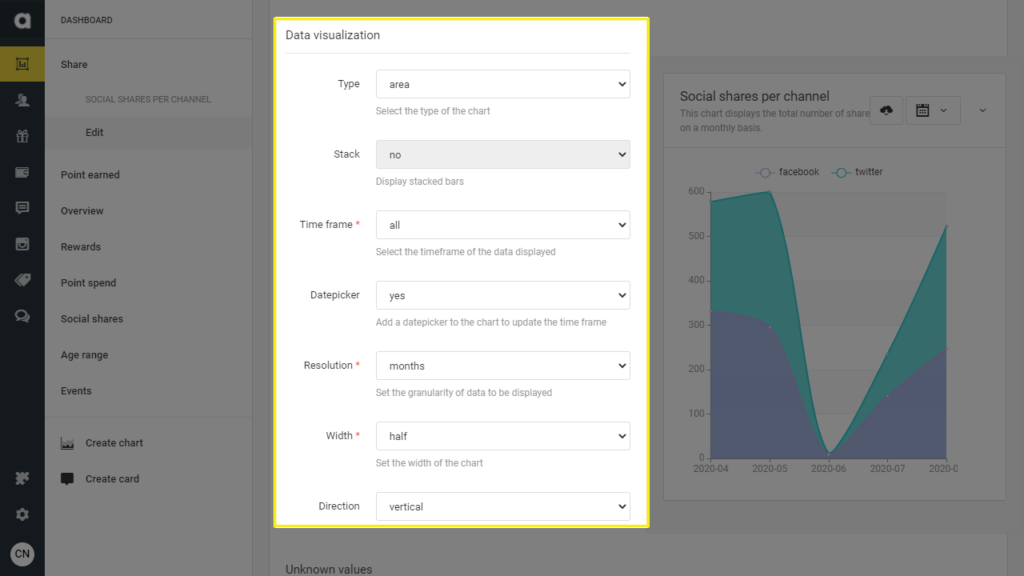
Select a chart type
Select the type of chart you wish to create: line, area, bar, or pie chart.Enable Stack for bar charts
When creating a bar chart, enable the Stack option to display data subsets stacked on top of each other. By default, subsets are displayed side by side.Select timeframe
Choose the timeframe for the data displayed on the chart.Activate date picker
Turn on the date picker to update the timeframe directly on the Dashboard.Select time resolution
Define the time resolution to specify the data granularity displayed on the chart.Adjust chart width
Select the width of the chart display: full, quarter, half, or one-sixth of the page.Choose visualization direction
For line, area, and bar charts, choose between vertical or horizontal visualization. The direction setting does not apply to pie charts.
Unknown values
Allow unknown values
If you’ve applied grouping to the chart, decide whether to display data with unknown values as a separate group on the chart. For example, this could represent the number of customers without a tier in the loyalty program.Name the unknown group
Ensure that the name does not exceed 32 characters.
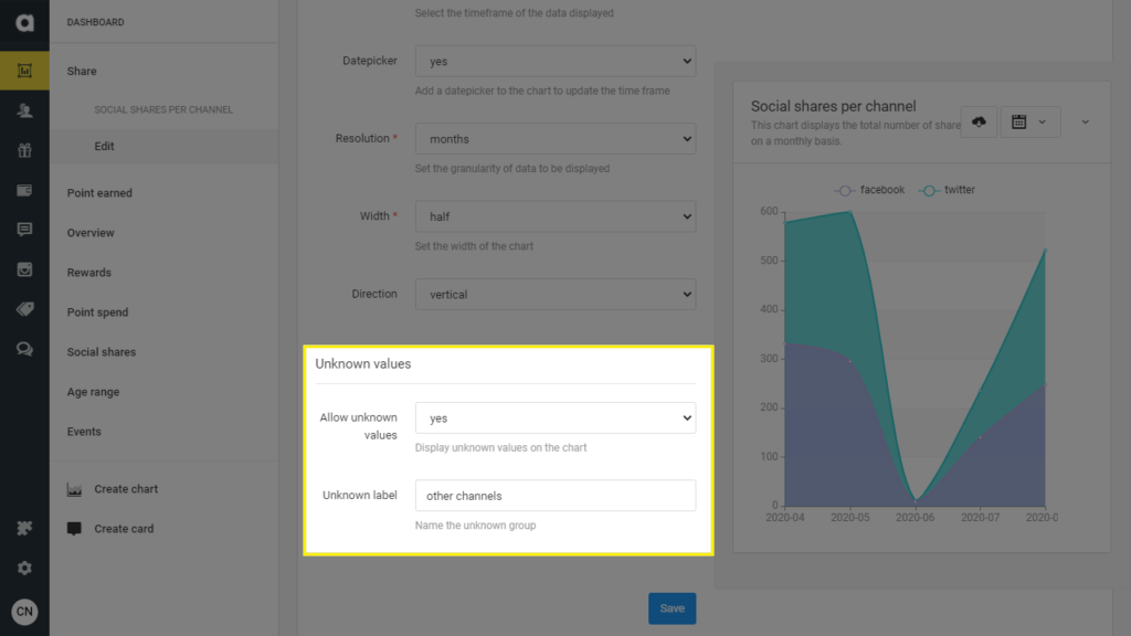
Before closing the page, remember to save your chart by clicking the Save button.
Configuring scorecards
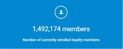
A scorecard displays a single key metric, serving as a benchmark in your loyalty program. This could include tracking the average basket value per tier, total points earned or spent, the overall number of loyalty members (categorized by gender or age), or average daily or monthly point earnings.
Add a new scorecard
Click the Create card button on the sidebar or the top right-hand corner of the Dashboard.
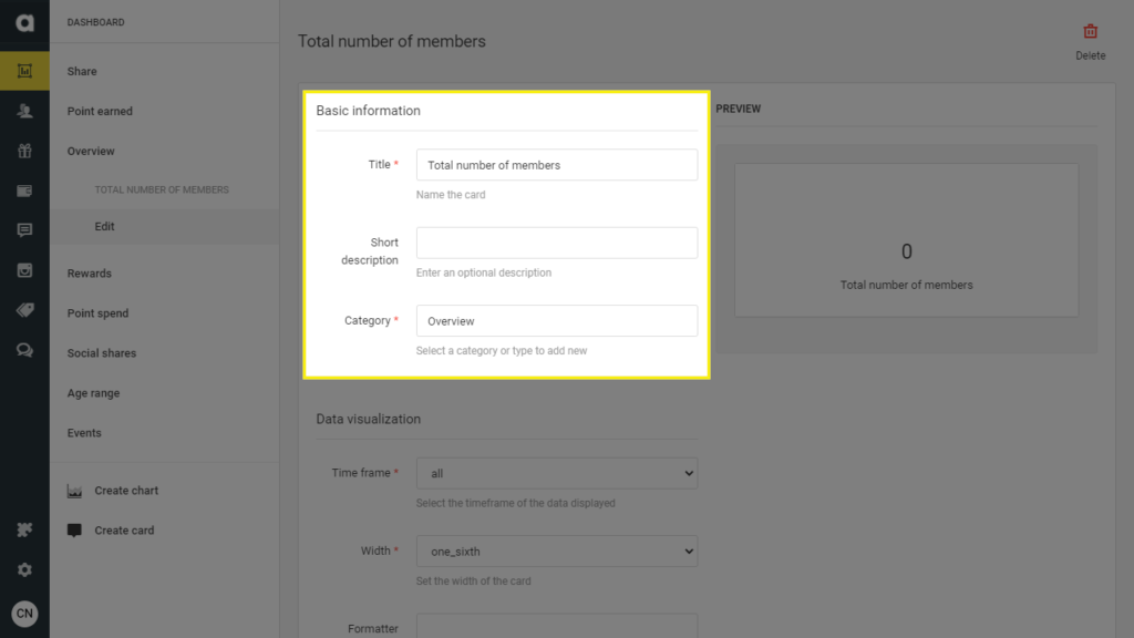
Basic information
Add card title
The title will appear at the top of the card on the Dashboard. Please ensure that the title does not exceed 32 characters.Provide a short description
Include a brief description that does not exceed 128 characters.Select or create a category
Choose an existing category from the dropdown or create a new one by typing a category name into the field. Categories are displayed as separate tabs or pages on the Dashboard where cards and charts are organized. Make sure the category name does not exceed 32 characters.
Data visualization
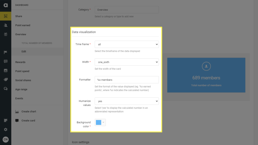
Select timeframe
Choose the timeframe for the data displayed on the card. Please note that date pickers cannot be added to cards.Adjust card width
Select the width of the card display: full, quarter, half, or one-sixth of the page.Provide context for the calculated value
Add a descriptive phrase to the calculated value to make it easily understandable. Ensure that the phrase does not exceed 128 characters. For example, you can add %s earned points, where %s represents the calculated number.Enable abbreviated representation
Select yes under the Humanize values option to display the calculated number in a shortened format. For example, 2681 will be displayed as 2.7K on the card.Choose background color
Select a background color for the card to enhance its visual appearance and readability.
Icon settings
Choose an icon for the card
Select an icon to be displayed above the calculated value from the dropdown menu.Customize icon color
Use the color picker to set the color of the selected icon.
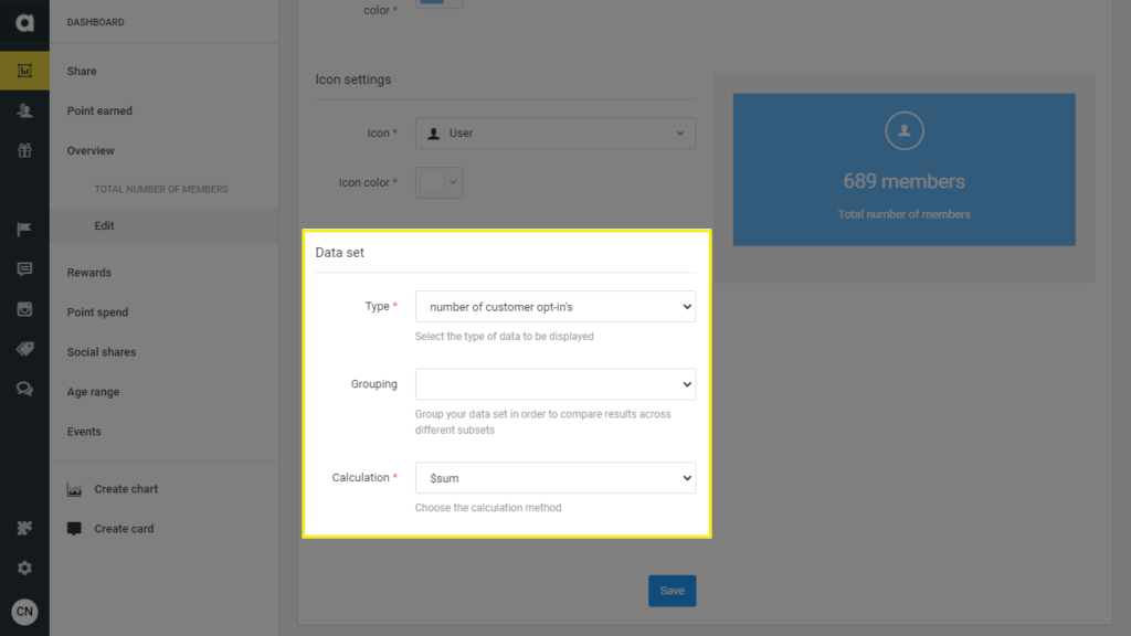
Data set
Define the card data type
Select a data type from the dropdown menu to determine the information displayed on the card.Choose a grouping method
If applicable, select a specific data subset to be calculated on the scorecard.Select data groups for display
Choose one or more data groups to be taken into the calculated value displayed on the card.Select the calculation method
Select either average or summary as the calculation method to determine how the metric is calculated.
Don’t forget to save your scorecard by clicking on the Save button before closing the page.
Editing items
As previously discussed, you can always modify your Dashboard items.
Click the gear icon on the top right-hand side of your chart or card
Select the Edit option and adjust the settings as needed
Click Save
Cloning items
When creating a chart or a scorecard similar to an existing item on the Dashboard, you can clone it instead of starting from scratch.
Click the gear icon on the top right-hand side of your chart or card
Click Clone
Removing items
If you no longer need a chart or a scorecard, you can remove it from the Dashboard. Please be aware that this action is irreversible, and the removed element cannot be restored.
Click on the gear icon on the top right-hand side of your chart or card
Click Remove
Ordering items
Simply drag and drop items to rearrange the order of charts and cards on the subpages of the Dashboard.
Exporting chart data
To export displayed chart data, click the Download located at the top of the chart. The data will be saved to your computer as a .xls file.